Hey everyone! Its been a week since I opened the icon poll so here are the results of what people voted for
As a reminder voting is handled by single transferable vote so every round the lowest voted entry is eliminated and the next choices of the people who chose that option is given points. If a person didnt rank all of the entries and doesnt have a next choice no other option gets their points
Icon Style
The icon style vote had 58 votes submitted total
Heres the final graph:
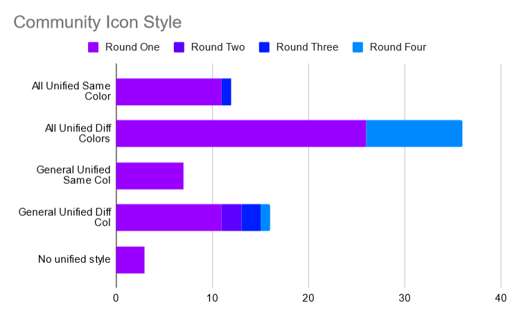
Round one is all of the first choice votes for the people who voted. For round two no unified style was eliminated and the votes were spread to other options. For round three general unified same col was eliminated and for round four all unified same color was eliminated
The overall winning option was All unified diff colors, winning with 36 final votes compared to general unified diff colors’ 16 (and having by far the most first choice votes)
Ill be switching some of the communities (ones I made the icon for) over to the new style and new communities in the instance will be created with an icon in the style. Community mods though have the final say in what their community icon looks like and can choose not to follow this result if they want
Make sure to follow the branding guidelines of your programming language, engine, etc. Some require attribution if you edit the logo, some dont allow logo modifications, some dont have a default logo, etc.
If your language, etc. doesnt allow icon modifications you can do the same icon style but instead of a gradient logo you just have the logo itself, you can make a new logo for your community, or you can just have that logo
Icon Shape
The default icon shape poll had 37 total votes and was handled in the same format as the icon style
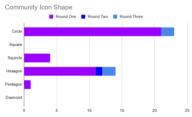
Pentagon was eliminated first and then squircle was eliminated
The final result was circle winning with 23 final votes compared to hexagon’s 14
Community icons will have a circle shape in the instance by default but I will be pushing out a change eventually to allow toggling between different shapes for yourself for the communities on web
Thanks everyone for voting! You should see icons start to change in the instance soon
First, I’d like to thank @Ategon for their work on these icons and also for running this poll to determine what people who care about the issue want.
It’s no secret that I vastly preferred the “All Unified” option - the coherent visual identity would not only help recognition across different instances, but it would also strengthen the community and the sense of belonging on this instance.
With this in mind, I find myself somewhat puzzled by the this remark in the post:
Community mods though have the final say in what their community icon looks like and can choose not to follow this result if they want
While the question of icons might seem minor (maybe even trivial), allowing this would set a precedent that undermines the effectiveness of such polls in the future. Everyone who cared about the issue had the opportunity to vote for an entire week, and the “All Unified” option won by an overwhelming majority.
If even one mod disregarded this result, it would run counter to the result of the poll, effectively making the end state undesirable for the supporters of any of the options: the icons wouldn’t be “all unified”, the “general unified” option wouldn’t happen either because at least some language-specific communities would also have the unified icon, and obviously, “no unified style” voters would be dissatisfied too.
Yeah optimally all communities would follow the results of the poll but there are some exceptions to account for and at the end of the day the mods should be the ones running the communities, not the admins. There are some communities that want to be the community for that topic across the entire fediverse rather than being the programming.dev version of that community so recognition across instances might not be needed for it
This will likely be one of the only polls I run that affect communities themselves since I want mods to be the ones running the communities while admins just deal with things about the site itself (and its ran just so I can have a default style to create new communities with)
With this vote result the vast majority of communities will be following option 2 with a couple exceptions
Ill be running a poll in the future to gauge if people like how the instance looks after the poll results being in action for a bit in this format
Fair enough, I can understand the emphasis on mod autonomy after the recent Reddit events. I really like this instance and appreciate the work you and the other admins do to make this a great place.
Could the logos be enlarged to occupy the entire minimum safe area (MSA) for maskable icons? E.g:
They’re currently a bit small for visually impaired users. I’m guessing that might be a combination of both the current logos styled with a large margin, and the default CSS cropping a mask using the maximum sized circle inscribed inside the square resolution. The later is a common approach that I don’t think we’ll be able to fix for all client apps, but the former can be safely addressed without risk of cropping artwork.
While where at it with updating icons, it might be worth doing a lossless compression of the icons and banners to reduce server bandwidth and improve page load times. I’m not sure if this is something pict-rs used by Lemmy already does in the backend, but that might also be an idea later on. Manually compressing PNGs for now could help with mitigating the load from the influx of Reddit users hugging the site in the interim:
Alright yeah ill re export them in a bit to do both of those
Thank you so much!
Not sure of the compatibility implications for Lemmy, or integration with pict-rs, but if you toggle the setting for lossless compression to export as WebP instead of PNG, the site above reports a ~40% memory size reduction: for at least the example Rust PNG icon I linked above. WebP is well already supported by browsers and mobile platforms:
BTW, if anyone finds a offline or FOSS CLI utility that matches the lossless compression results provided by ShortPixel and other sites like it, I’d love to know. I’ve found a few, but all fall short of the optimization these proprietary websites provide.
