Either set the scaling to 1 or 2 if you want it to look sharp

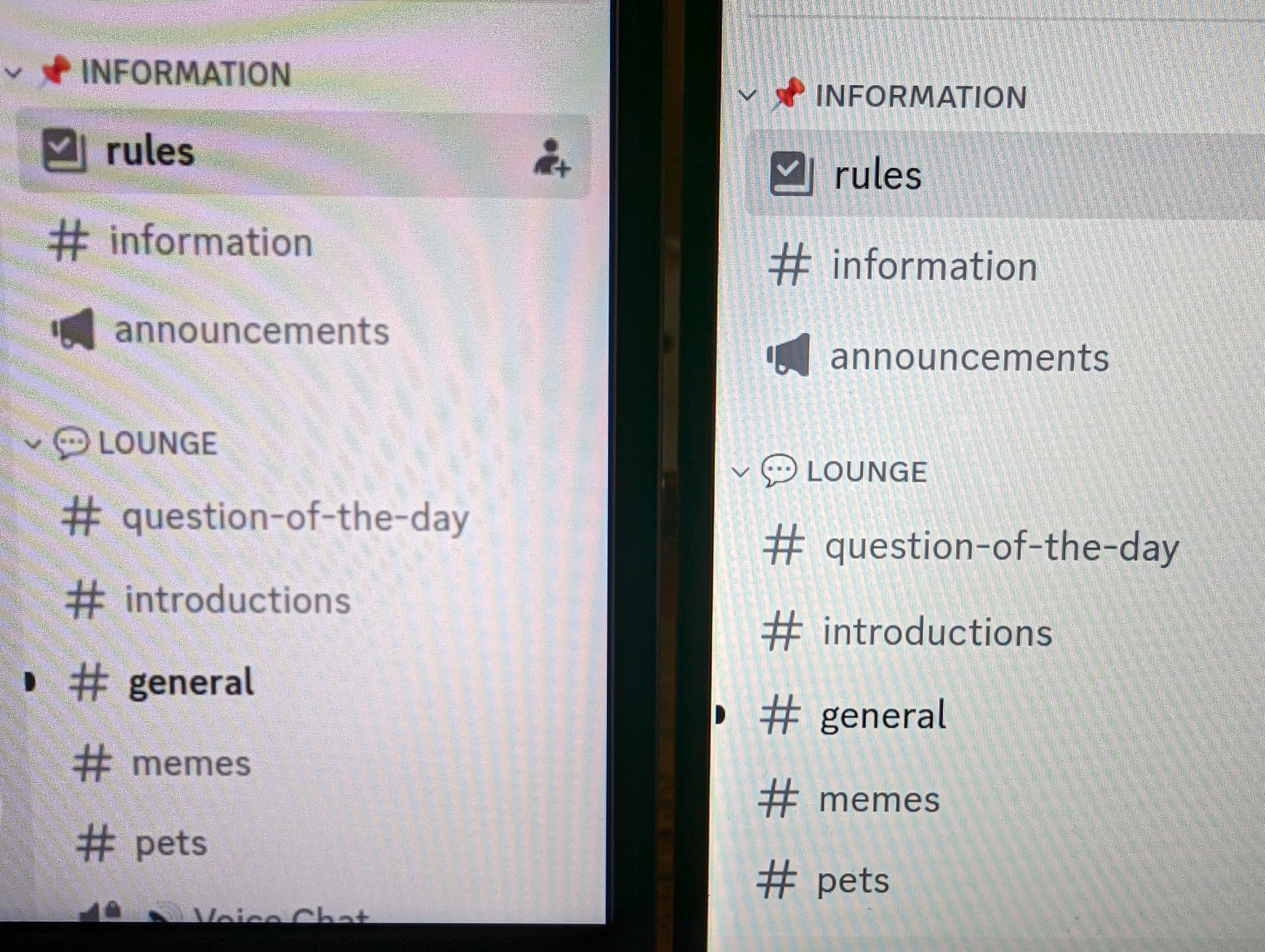
I just switched the scale to 2x on the Framework and it also looks blurry. Actually, I wanna say the Framework display at 2x is worse than at 1.25x… I can see more of the fuzz around the fonts now. Framework at 2x on the left, Dell XPS 13 with the font size increased on the right.
It’s better to increase font and icon sizes if they are too small.
I haven’t tried this, but seems logical.
Coming from a Dell XPS 13 where everything Just Works ™ , I’m bummed Framework’s choice for display isn’t Linux compatible. I might just end up returning the Framework, the blurry fonts are messing with my eyes…


The point of calling something is fad is a way to tell you that you shouldn’t invest a lot of time into this because that knowledge will become obsolete soon.
I mean this is particularly relevant in the JS world because every week there’s a new revolutionary framework that renders the previous framework obsolete. (Although, not sure if that’s slowing down now…)